For a recent project in my text mining class we were required to explore ways of visualizing textual data. This is a tricky problem due to the nature of text, mainly because it is both categorical and sparse. Visualizing numerical data is, relatively speaking, a piece of cake, because real numbers can all be related to each other rather easily. But categorical data doesn’t generally have it that easy. Even if you can order the data, such as putting words in alphabetical order, it doesn’t always give you much insight into the text that the words comprise. After all, we tend to care more about what the text says than about what letters the words it uses start with.
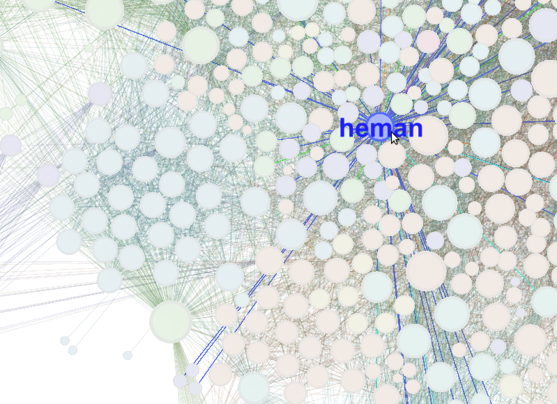
My work was inspired by the cool stuff at Visual Complexity, and heavily influenced by Chris Harrison’s “Visualizing the Bible” page. For one of his visualizations Chris Harrison’s approach was to extract a “social network” of sorts from the biblical text. The more often a name occurs, the bigger it and its dot are on the chart. If two names occur in the same verse they are considered to be somehow connected and have a line drawn between them. The result is pretty cool, so I decided to apply the same general approach to the leaked emails from the University of East Anglia’s Climatic Research Unit.
I grabbed the emails from somewhere-or-other on the Internet (a torrent, maybe? The filename is cru-foia.tbz2) and set to parsing them. Unfortunately, whereas the names of the Bible have been conveniently compiled, nobody has made a list of names in the CRU emails, as far as I know. So I had to resort to automatic means. To that end, I downloaded Lev Ratinov’s LBJ NER tagger from UIUC CS and used it to identify the names in each email. If two names showed up in the same email, a connection was made between them. The more times they co-occurred, the stronger the link. Once all of the names and their connections were counted, they were dumped to a file in the GEXF graph interchange format.
To actually produce a visualization, I used Gephi, an up-and-coming graph visualization tool that allows real-time, interactive visualization of complex graphs. I also worked with a couple of other datasets: a “scriptures” dataset, including the Bible, Apocrypha, Book of Mormon, and Pearl of Great Price; and a dataset covering LDS General Conference addresses from the 1880’s to about 1950. The General Conferences data has been processed using any top non-stopwords (words that aren’t things like ‘the’, ‘to’, ‘with’, etc.) rather than names, which gives less-interesting results.
The results with Gephi can be quite striking, as with the “Heman” image at the beginning of this post. Here’s a video of using Gephi to work with the CRU data:
http://vimeo.com/10918828
Visualizing Texts as Networks from gephi on Vimeo.
Leave a Reply